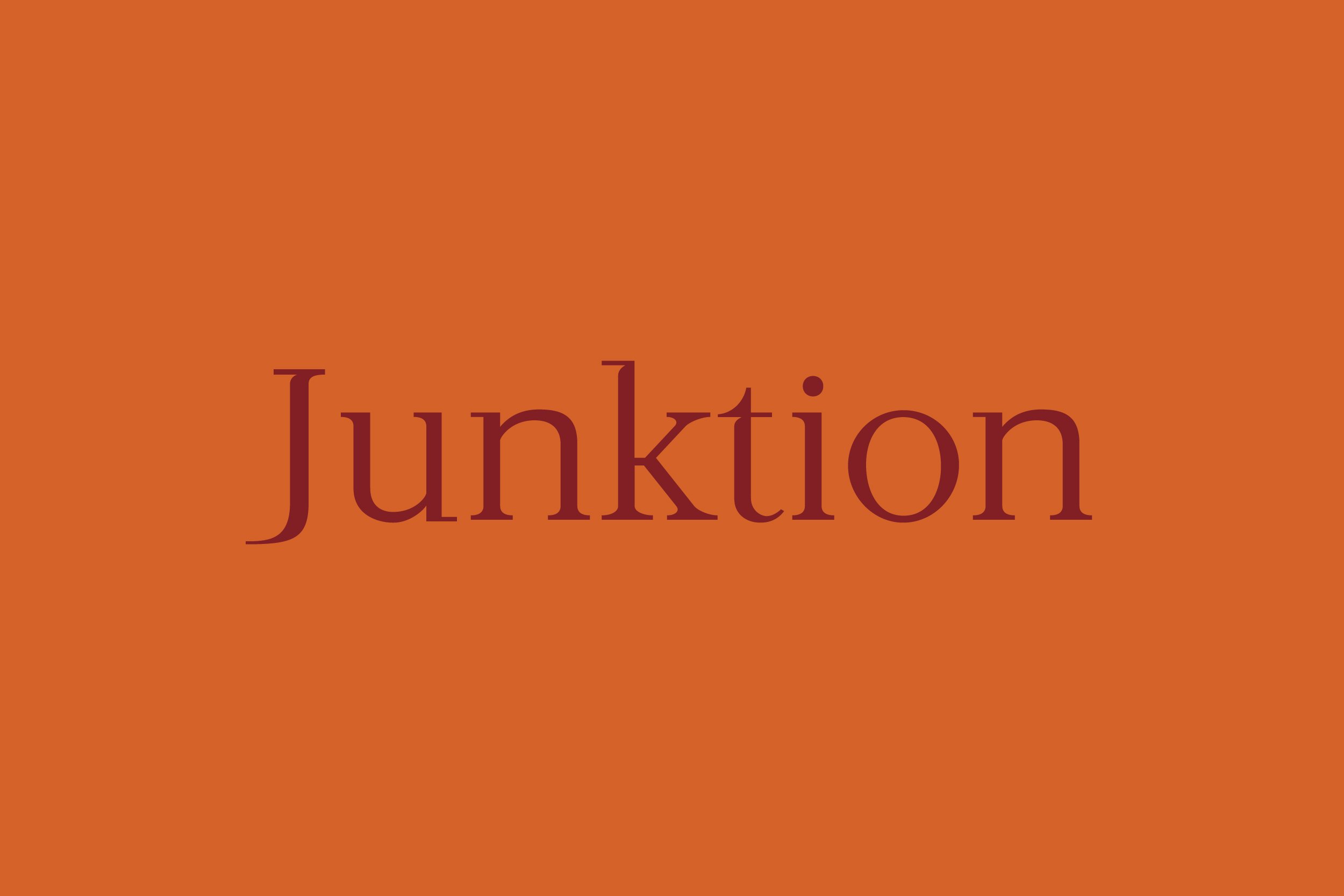
Junktion
A single weight serif typeface inspired by the flow of a calligraphic pen
Having gained experience in design through working in an editorial setting and inspired by the likes of Jonathan Hoefler and Mark Bloom I wanted to use some of my time studying at NUA to design a typeface.
The initial idea for Junktion came from writing the alphabet with a medium-nibbed calligraphic marker, specifically what happened when writing the letter J. The interaction between the crossbar and stem of the letter, drawn in one sweeping motion, formed the key characteristic from which to build the full typeface.
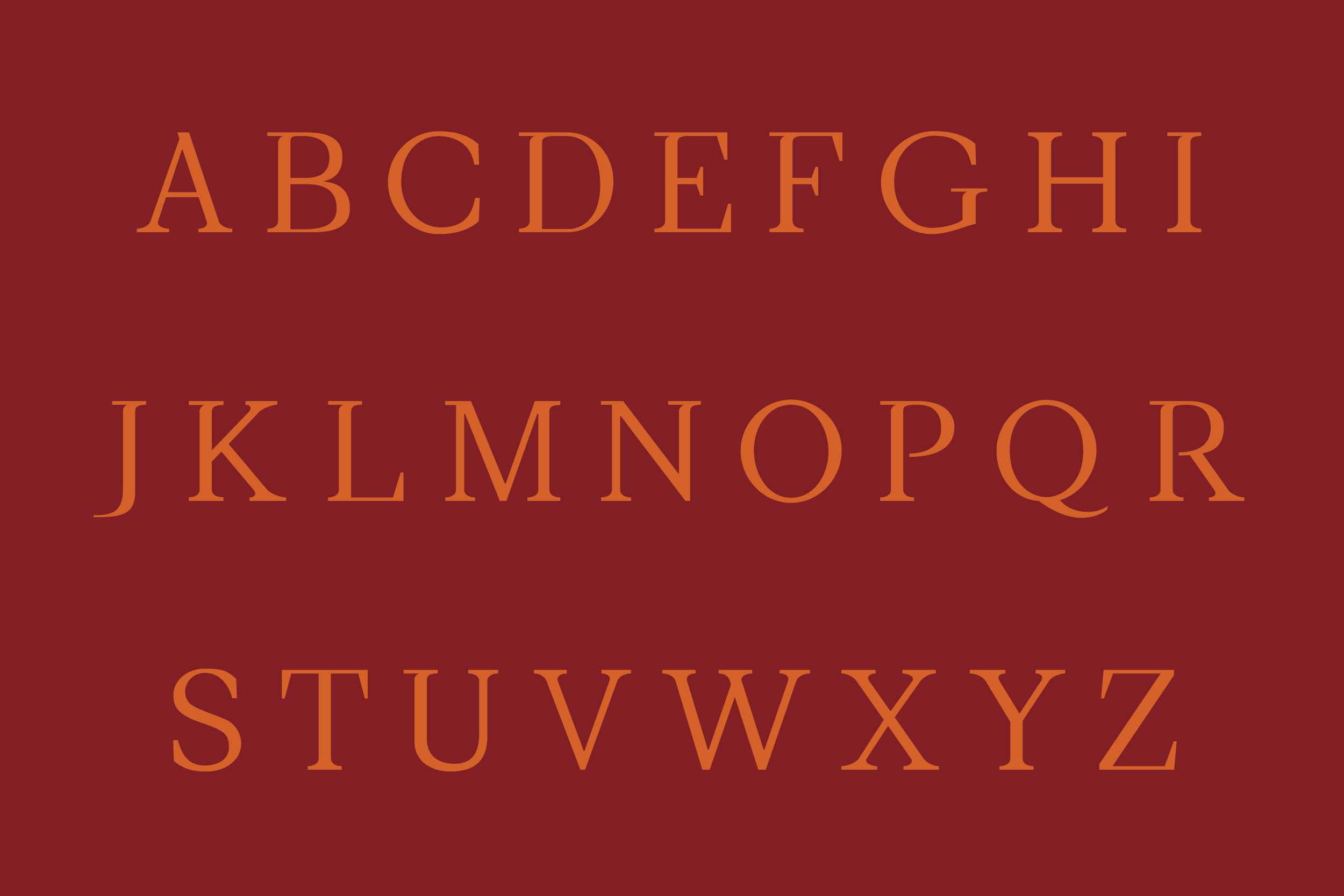
With a limited character set (uppercase, lowercase, numbers and basic punctuation), the typeface is designed to perform well in display settings of 32pt and above.
I also designed a zine that could be distributed to purchasers of the typeface and be used as marketing material. Folding out from A5 to A3, the zine shows the character set of the typeface and explains its origins. The reverse showcases the uppercase and lowercase alphabets.