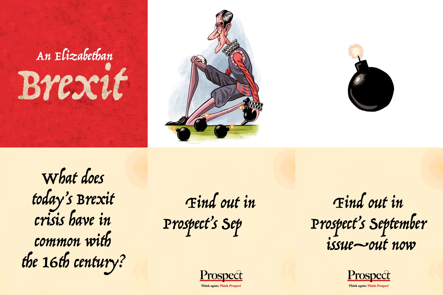
Prospect motion graphics
Video and motion design to promote stories, magazine issues and awards
After Prospect’s 2021 redesign, I created short videos to promote each issue that highlighted key stories and writers as well as showcasing the imagery used in print.
The videos, produced for social media, aimed to reformat the content of the print product—primarily read by an older audience—and present it in an eye-catching way to a younger, digital-savvy audience. This video format was also adopted to promote the magazine’s presence at the Hay Festival in 2022.
The videos make use of Prospect’s new typefaces, Sharp Grotesk designed by Sharp Type’s Lucas Sharp and Frame from Commercial Type’s Paul Barnes, and new brand colours which include a vibrant orange and purple.
Making use of the new logo, produced during the magazine’s redesign, I also created a video ident to be used at the start of Prospect’s video content. Simple intro and outro animations utilising the line under the wordmark, a feature of the logo since the magazine’s first issue in 1995, clearly label the content as part of Prospect’s digital offering. This has since been adapted for use as a splash screen when opening the new app.
Motion has also played a part in awards ceremonies. Each year, Prospect hosts the Think Tank Awards to recognise the work of think tanks to influence policymakers and generate new thinking about how to deal with the biggest problems of our time. In 2021, for the first time, winners were sent a set of motion graphics to use across their social media platforms.
These new motion graphics build on work I previously produced to try and drive interest in specific articles from the magazine or issues as a whole. These consisted of animating cover artwork or illustrations from the pages of the magazine.

